
 Strategy Tool
Strategy Tool
Strategy Tool
Chemistry that understands your biology. A wellness and supplements brand that wanted to feel like clinical authority and lived-in calm at the same time — and found its voice in a single, owned letter.

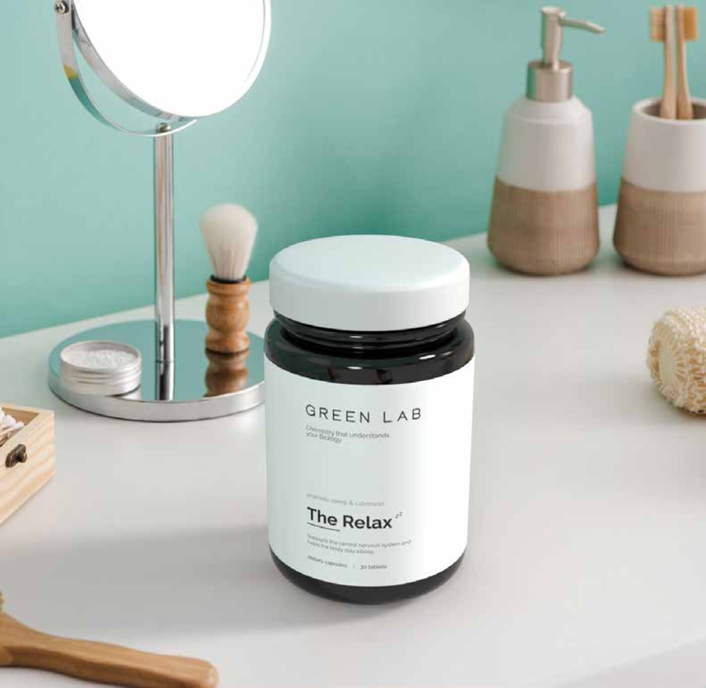
Green Lab sells lab-tested supplements built on natural chemistry. The category is loud — neon labels, hard claims, gym imagery. We pulled in the opposite direction: the calmest brand on the shelf.
The identity rests on one letter. In low-awareness markets the full wordmark does the work; in high-awareness markets the G symbol stands alone — a circle that quietly references both a molecule and a leaf. Pair that with a near-monochrome palette and editorial photography that feels like skin in soft daylight, and the science recedes into something you actually want to live with.
Wellness is a category of noise. We approached Green Lab from the opposite end — what does a supplements brand look like when it has nothing to prove?
Discovery began on the shelf — a forensic audit of the category's visual tics, from neon claims to gym stock photography. Strategy framed Green Lab as the calm authority — clinical without being cold, natural without being naive. Creative work compressed the entire identity into a single, ownable letter — a circle that doubles as molecule and leaf. Every supporting decision — type, palette, photography direction — was measured against one rule: does it lower the volume in the room?

Two primary tones do almost all the work. Three quiet supporting greens and greys carry packaging, web and editorial without competing with the product.
Green Lab needed a system that worked equally well on a bathroom shelf, a pharmacy aisle and a phone screen. We shipped one that does all three.
The work covered the core identity and the standalone G mark, packaging across the supplement range — jar, label, secondary carton, insert — and a stationery system for clinic and trade. We art-directed the launch photography toward soft daylight and skin texture, codified the dual-mark logic for low and high-awareness markets, and bound it all into a brand manual the team can hand to a chemist or a creator without losing the tone.
"There is real power in owning a single letter of the alphabet — it's universal, instantly identifiable, and shorthand for the entire brand."
— Logo Strategy · Green Lab Brand Guidelines
Green Lab now reads as the considered choice in a category built on shouting. The single letter does the work — calm, instantly recognised, hard to copy.
The new identity unlocks a buyer who avoided the category entirely — someone who reads ingredient lists, not before-and-after posts. The brand can show up on a clean pharmacy shelf and a considered lifestyle edit without changing register. It now has the visual capital to partner with practitioners, clinics and considered retailers — and the room to extend into adjacent product lines without redrawing the world.